Svenska Bostadsfonden
Svenska Bostadsfonden has since 2008 been providing pioneering alternatives to invest in the Swedish property market. In 2019, Transfer Studio created a new visual identity that elevated the company to a higher league.
SBF's products and services had by then outgrown both their branding and communications efforts and the firm looked to expand and renew their proposition in order to reach new private and public investors. When a new CEO was recruited, Transfer Studio was commissioned to rebrand the company and deliver a comprehensive communication strategy that fitted their new company wide ambitions.
After mapping the old branding and pairing it with fresh data and market analysis, we discovered a number of omitted propositions that we translated into specific targets for the rebrand to deliver. Making sure the new brand embraced both their loyal and mostly senior client base as well as opened up to younger investors was key.
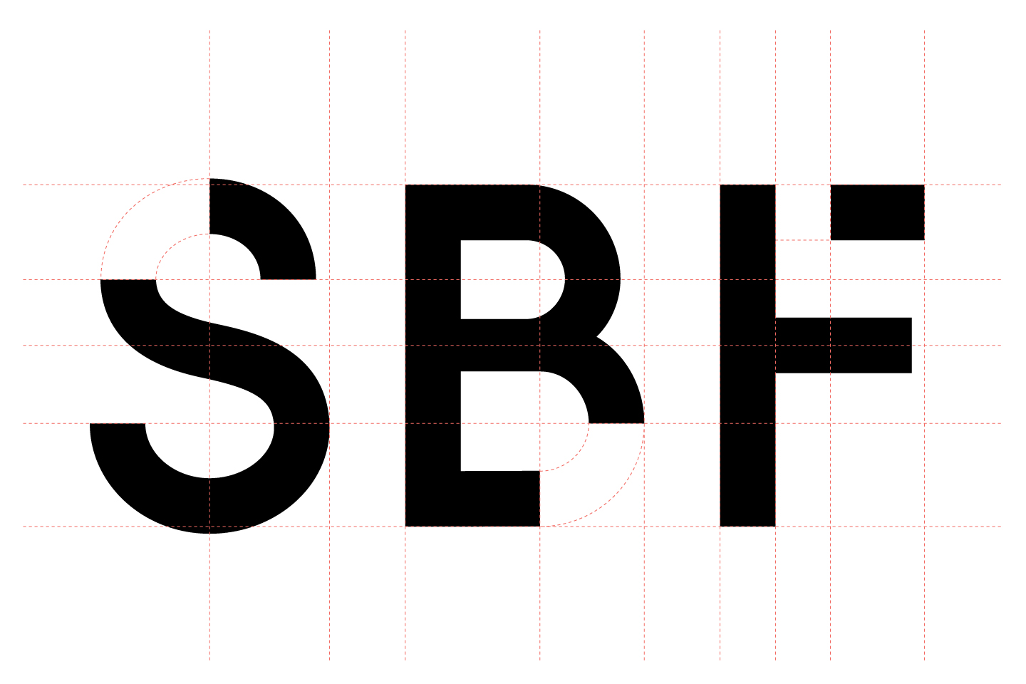
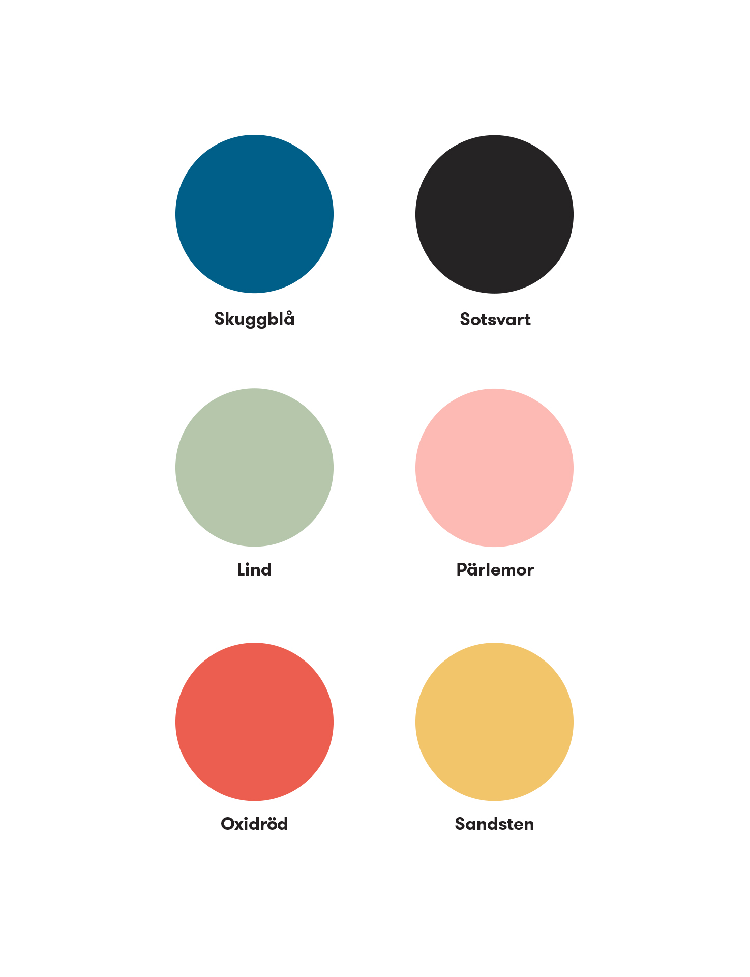

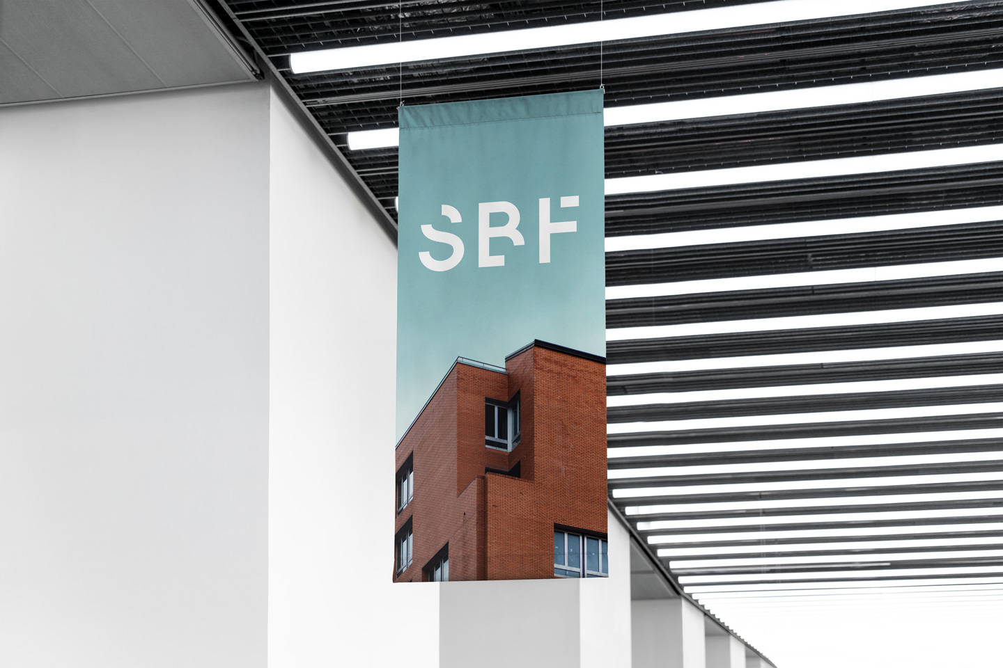
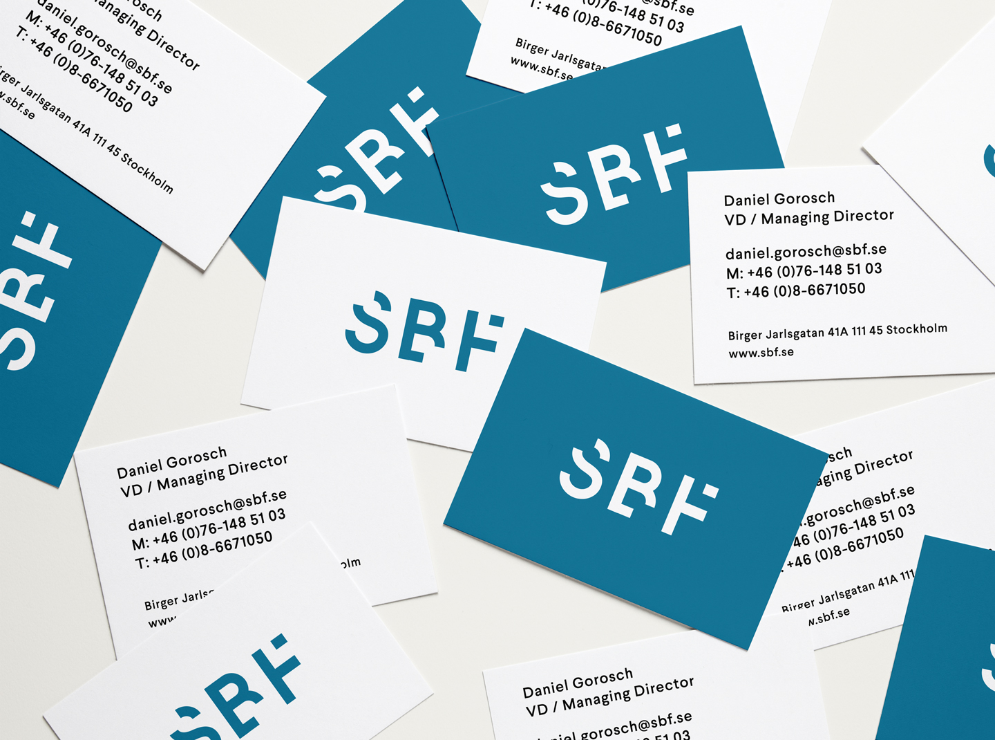
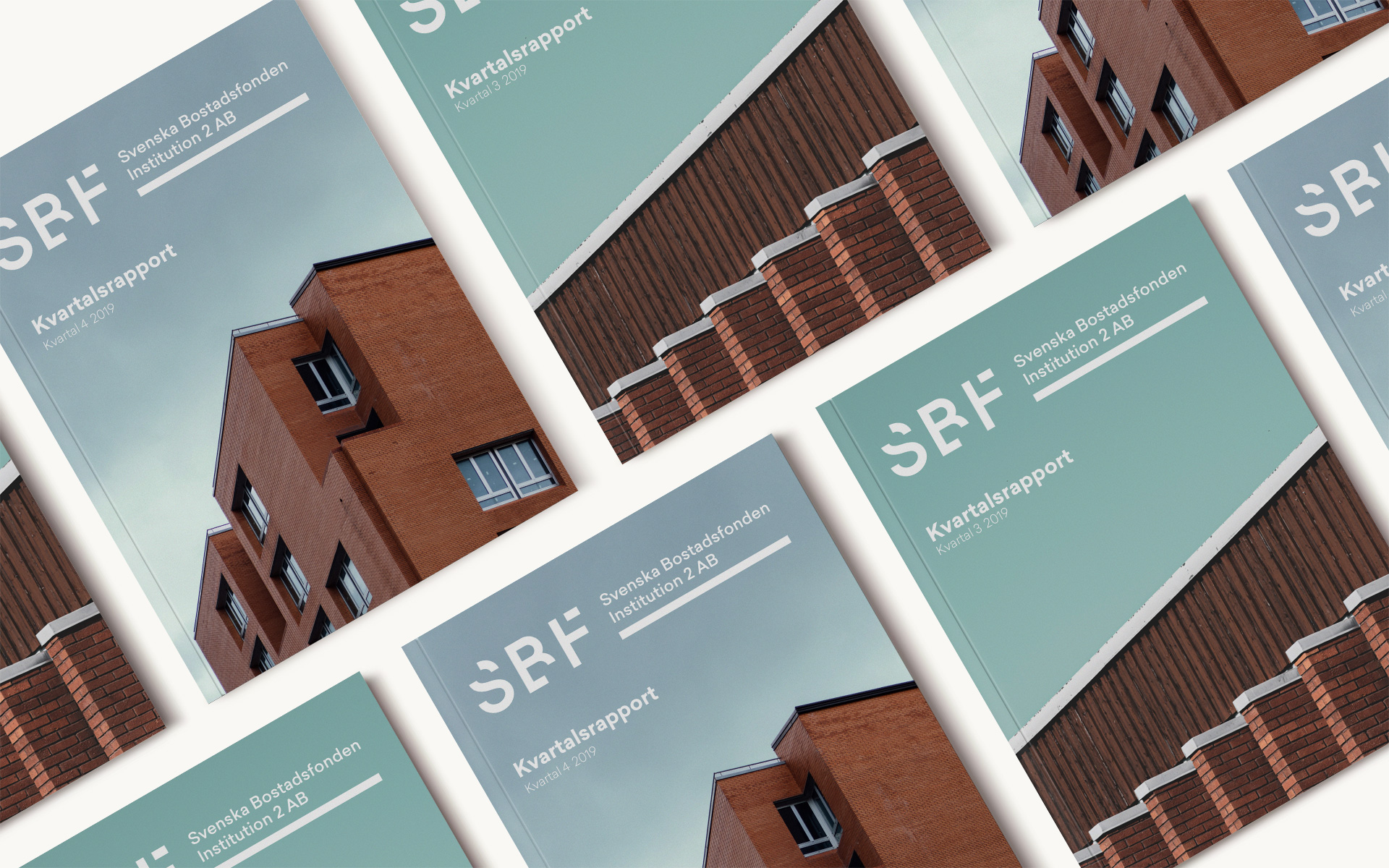
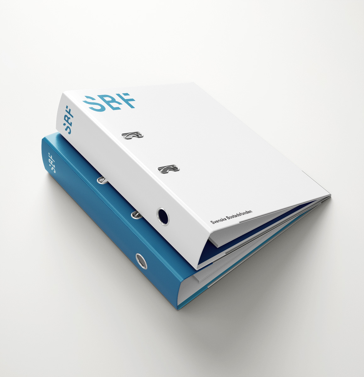
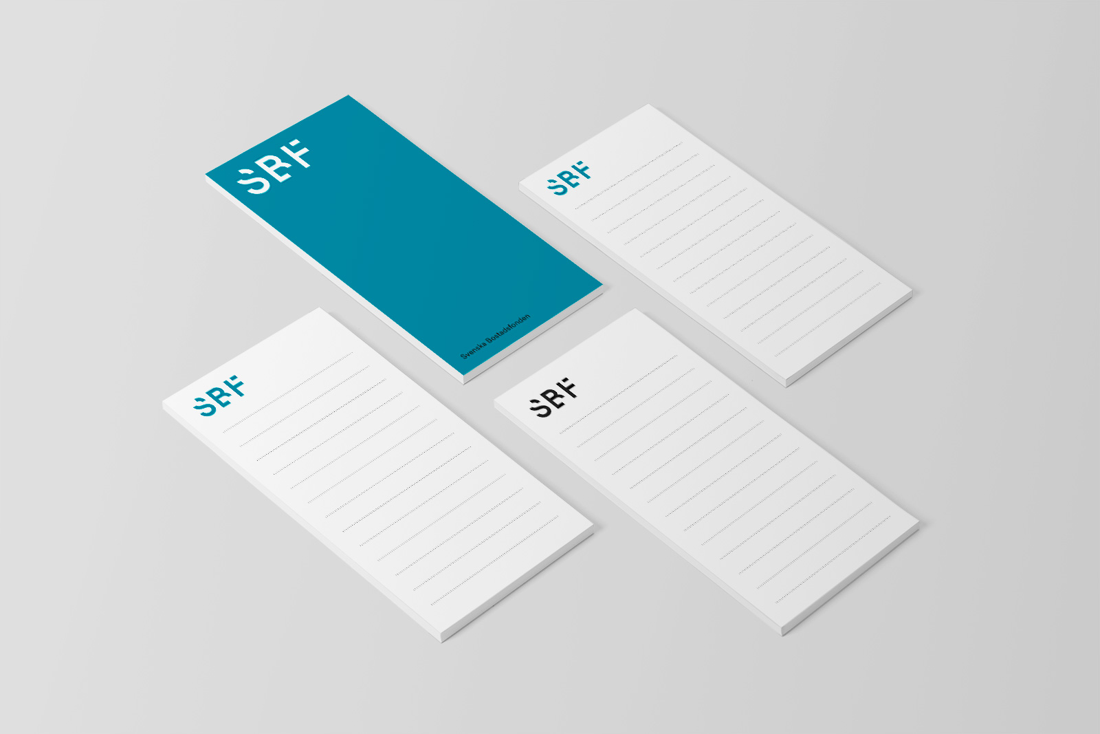
We opted for a fresh company color palette that was directly derived from the properties they own and representative of the type of buildings they mainly seek to acquire. The new custom company logotype is constructed by geometric elements evoking buildings in maps and architectural drawings, sprung from their role as property investment pioneers.
Paired with crisp and modern typography, we delivered a set of modern brand design guidelines that are clear and organised to provide company wide tools for a coherent voice in all mediums. This added level of quality control was crucial in order for SBF to be taken as a well-regulated and confident investment firm in all situations and in particular as a serious option for the larger institutional investors they aimed to attract.
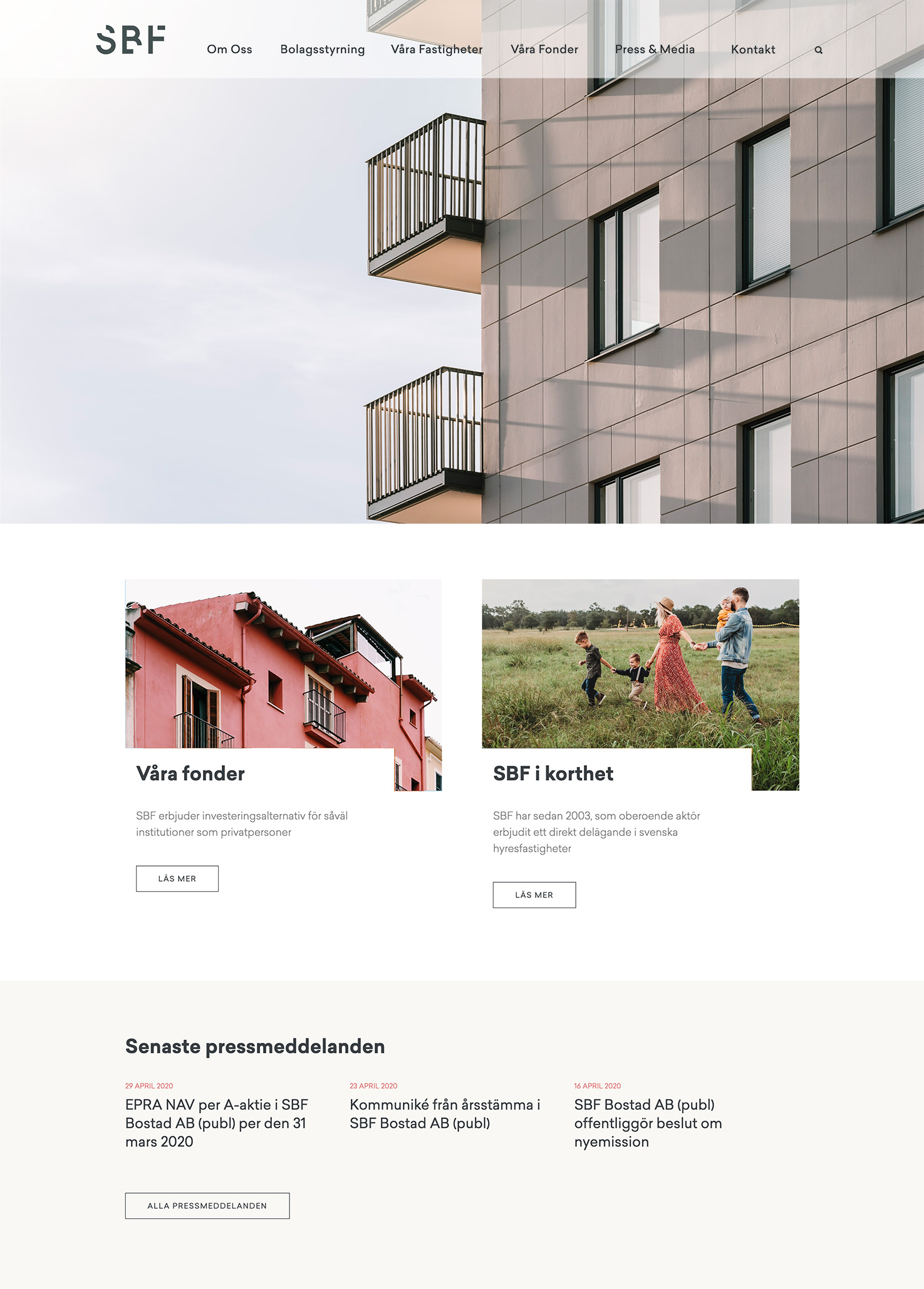
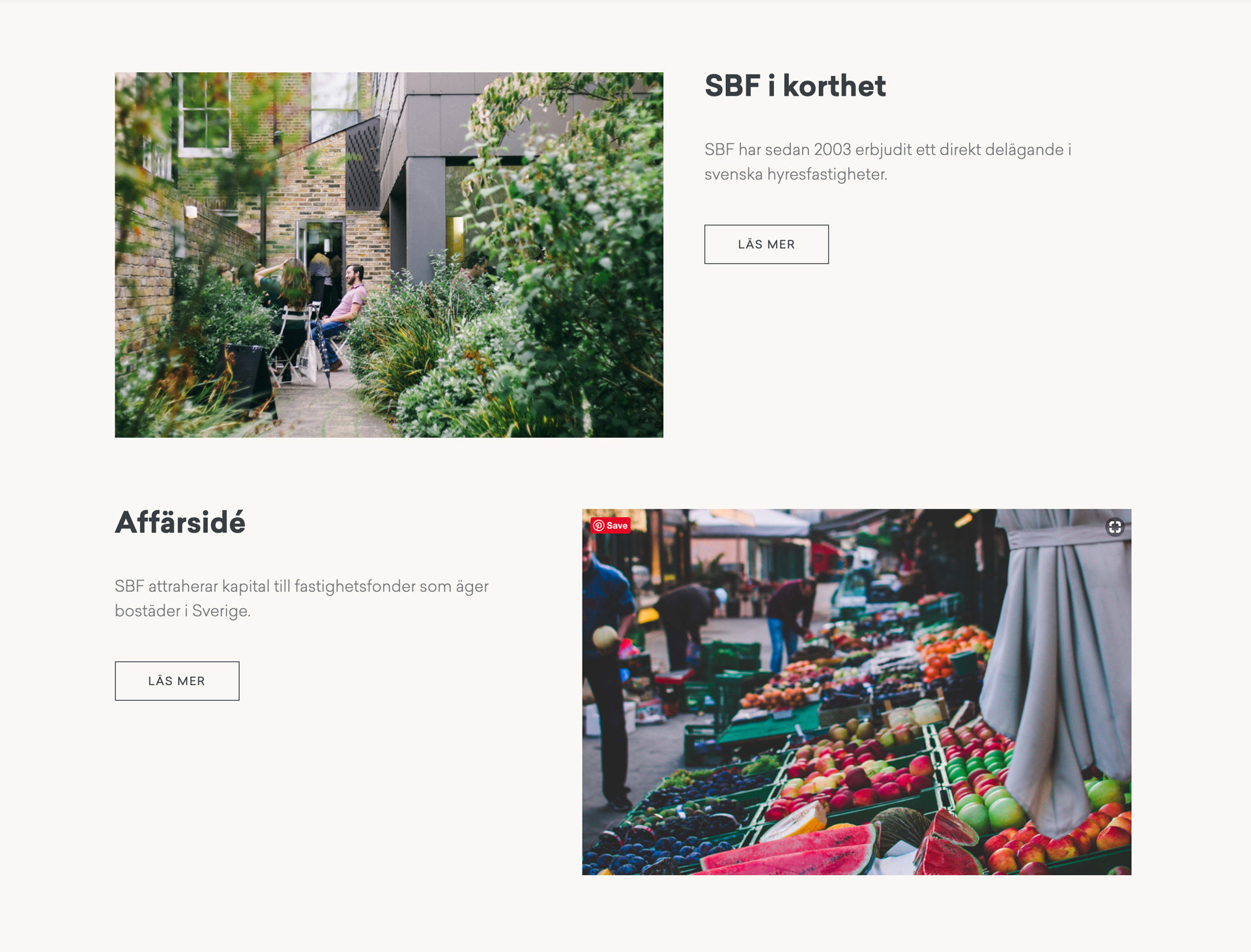

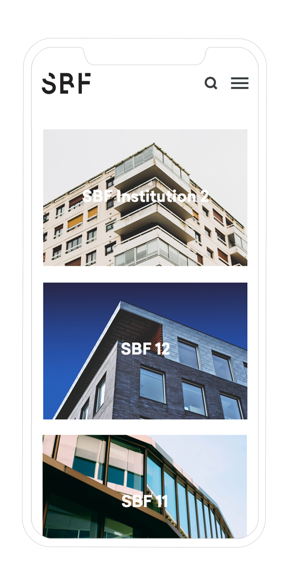
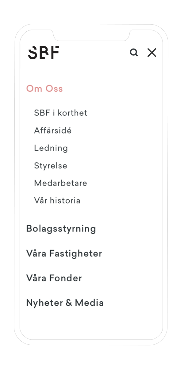
We further built a whole new digital infrastructure that seemlessly aligned all their product websites and digital channels – which until then had been managed by a random variety of external suppliers – under one single technical roof and gave the client back control over their own communication. The result was easy to use yet flexible enough to allow for continuous improvements – with shorter lead times – as the new visions are set in motion in the coming years.
